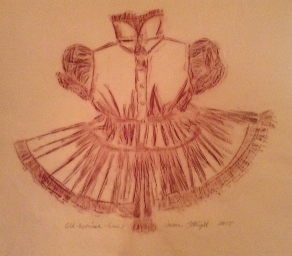
Anne Abbass


This slideshow requires JavaScript.

Daily Practice

My prints are created through the process of layering images, hand written script and areas of colour together. The images, text and drawings are taken from observations in daily life. The text is not meant to be legible, but to suggest bits of past memories and thoughts, as in a journal or diary. I use many layers and several printmaking processes in each print.

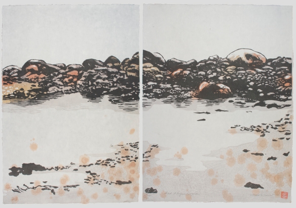
I spend a lot of time twisting and stretching my body into different poses in my daily ashtanga yoga practice.  The silhouetted figures shown in these works are performing different yoga poses, or asanas, in particular ones that I am finding challenging to do in their “ideal” form at the moment.  The point of doing these daily asanas is to train your body and mind to stay in a pose for 5 deep, calm breaths even though it may feel physically uncomfortable, so that we can take this calm approach in the face of difficulty and stress into daily life.

The images of the people doing the poses are solid, calm and still, in contrast to the backgrounds, which are loud, busy and frenetic. The background images come from a stack of prints that I recently discovered in my parent’s basement where they had sat forgotten since I made them over 20 years ago.  The number of layers and hours that went into these prints, as well as the energy and adolescent angst in some of them is like finding a lost diary, a window into my past. I tore each of the old prints into many smaller pieces, and found spaces to fit the figures into the new landscapes and compositions of the print remnants.  The resulting images represent a calm, still presence in the face of chaos.  Through practicing the yoga postures one hopes to build a layer of protection from the elements, and a way to find stillness in the present moment.

Biography

Anne Abbass is a Toronto based artist and printmaker. She holds a BFA from Queens University (1993). Anne was awarded the Don Phillips Scholarship at Open Studio in 1994 and has been an artist member of Open Studio since then. She has worked as a user experience consultant for websites, and now spends her time at home with her three young kids. She currently sits on the board of Open Studio and works from her home studio.

Sonya Filman


This slideshow requires JavaScript.

Approaching the Varied Editions Gallery as a project space, Filman engages with images from her current research. Her current work considers the appropriation of scientific discourse and visual strategies by practitioners of pseudoscience. Working through resources drawn from library archives, rare books, and educational cinema, Filman presents these images as works in progress — preparatory sketches for a future artists’ book.

sonya-filman-ve

A Measure of All Possibilities (Detail), 2015, ephemeral screenprinted book, 13.25” x 19” inches (folded).

Sonya Filman is currently a Master’s Candidate in Fine Art at York University. She received Open Studio’s 2014/15 Don Phillips Scholarship, and has held positions at the Blackwood Gallery, Open Studio, C Magazine, and Gallery 44 Centre for Contemporary Photography. Utilizing print media, photography, sculpture and drawing, Filman explores the ideological influences and power dynamics that inform documentary media and other authoritative modes of representation. In considering all imagery to be imbued with ideology and cultural influence, her work is constantly related to the futility of visual representation in properly describing reality.


Cheryl Kaplan


This slideshow requires JavaScript.

Cheryl Kaplan spent the first portion of her career as an art director in advertising, developing award-winning, internationally acclaimed campaigns for just about everything from cars to beer, and from financial institutions to charitable organizations and everything in between. Her professional focus is now exclusively on her art, as she divides her time between her studio at home and at Open Studio.

By means of a narrative drawing style, she aims to entertain and provoke, often leaving it open to the viewer to interpret the ultimate direction of the plot. She is highly influenced by the classic decorative styles of Mucha and Klimt, but she has fashioned her own unique style by blending it with her deep-seeded attraction to the art of graphic novels.

“Kapgun” was just a fitting badass nickname from a co-worker that stuck.

Kapgun Wordmark

Susan Fothergill


This slideshow requires JavaScript.

Artist’s Statement

This selection of prints highlights the technique of frottage, traditionally used for brass rubbings. The laces and textured pieces I love, lend themselves to this process. It is experimental for me, involving trials with various drawing instruments and many, hand-made Japanese papers. These are the results, some of which are made into screenprints.

I love textiles with history and choose pieces that are hand-made, delicate-looking, and which resonate [with me] emotionally. Memories, personal longings, ephemera, antique laces and diaphanous materials are some of the things that speak to me as I choose pieces to highlight from my collection of women’s and girl’s special-occasion garments.

02sf2015oldfashionedgirldress-jpg

Old Fashioned Girl’s Dress, 2015, Frottage, 25” x 29”

Aprons in particular trigger immediate responses from the women I know. They range from hostile, “ They remind me of drudgery. I’d tear them up.” to, “ It’s exquisite. I’d put it in a shadow box.” I want to preserve the aprons and pinafores in another way, on another level. These are disgarded womens’ works, once-treasured. I rescue some of them and then they become my work. By changing scale, papers, colours, or adding text and other embellishments, I become involved with each new piece. I develop an emotional connection to the unknown maker and all the people handling it over the years. There is a chain of spirit connection with the lovingly created items, some tokens of love that know no boundaries.

Biography

Susan Fothergill is a Toronto-born fine art printmaker. Her earlier work, both home and abroad, included art direction in the book publishing and newspaper businesses, and theatre dressing. After raising two children she worked in the film and television businesses as both a set decorator and scenic painter. Her studies include drawing and painting, photography, English literature, Taoism and Celtic culture.

Susan’s approach to printmaking employs mainly silkscreen and linocut, and she uses this highly graphic medium to suggest layers and textures. There are often tiny elements hidden in her pieces, such as bits of poems, tiny creatures and other symbolic images drawn with ink and chalk or sewn into the layers, making each piece a fragment of a diary.

As an artist, Susan has won awards and has work appearing in national magazines, as well as feature films and television. Her works are emblems of the magical properties attached to specific articles of feminine apparel, and are made to evoke ghostly qualities of innocence and beauty, with suggestions of sensuality and comfort. It’s been said before that they reflect a tension of opposites within the feminine, having both power and softness simultaneously. Making varied edition prints is an ideal process to embody shifting consciousness.

Meggan Winsley


This slideshow requires JavaScript.

Meggan Winsley explores the technical reaches of the four-colour separation screenprinting process. The images she screenprints often reflect a state of deterioration. Her work highlights the elegance found in decay and brings new life to otherwise dying or abandoned subjects. Each photographic image is broken down to create a new composite work. In this way, the printing process parallels the subject matter featured in Meggan’s work. 

Meggan Winsley is a visual artist living in Toronto. She grew up in Haliburton, Ontario and later moved to Toronto to complete an Art Fundamentals degree at Sheridan College, 1999. She later obtained a BFA in Visual Arts from York University, 2004. She has been exhibiting her work since 2001. Meggan became an Open Studio member in 2005 and began teaching at the printmaking centre in 2006. Her work has been shown in numerous group and solo exhibitions in Canada, the United Kingdom, Taiwan and Australia.

Elizabeth Forrest


This slideshow requires JavaScript.

My current work is based on photographs and drawings made during trips to Newfoundland and to Western Japan. Though very different, Newfoundland and Japan are island-bound societies where the geography impacts powerfully to shape their unique cultures and values. My work contains landscape elements affected by intrusive memories and observations suggesting the process of personalization of places deeply experienced. —Elizabeth Forrest

A graduate of Glendon College, (B.A.) and the Ontario College of Art, Forrest then studied Japanese woodblock at Kyoto Seika University, Kyoto Japan. The Japanese term, mokuhanga (lit. “wood print”) is a contemporary term describing a traditional waterbased relief print medium requiring the carving of an image in a fine-grained wood, followed by multiple colour printing entirely by hand, using thick horse hair brushes to apply pigment and a baren to impress a Japanese mulberry paper on the wet ink. Forrest is interested in referencing traditional flat, mottled, embossed or blended surface qualities in tight registration, while employing a hybrid style (Western and Japanese) in carving. Recently she has begun to combine the medium with photo silkscreen.

06.E.Forrest.VEimageOS.2014.And it began to rain diptych.

And it began to rain diptych, 2014, colour woodcut on Japanese mulberry paper image and paper size 23.25 x 34”

Forrest’s work has been collected by The University of Lethbridge Art Gallery, The National Library of Canada, and Toronto Public Library, Special Collections, The Bank of Montreal, the Union Bank of Switzerland and many other corporate and private collections. In 2014 she exhibited at the Canadian embassy in Tokyo, and won a prize at the International Mokuhanga Exhibition at Tokyo Fine Arts University. Her work is also represented in Japanese Woodblock Print Workshop, by April Vollmer (Watson/Guptill 2015), The Woodcut Artist’s Handbook by George Walker (Firefly Books, 2005), and the U.K. second edition of Japanese Woodblock Printing by Rebecca Salter, (Thames Books 2013). She has taught many workshops in mokuhanga both in Toronto and by invitation in Hamilton, Ottawa, Montreal, and Sherbrooke, Quebec. Additional information is available at www.elizabethforrest.ca.

Laurie Zinkand-Selles


This slideshow requires JavaScript.

Laurie Zinkand-Selles’s work considers time and memory, contrasting the brevity of our human experience with that of historical/architectural structures and environments. Her recent series of photo based screen prints, draws on historical images of Toronto and considers the evolving nature of the city. They are narratives of the past within an architectural or geographical context. Her work is inspired by travel, photography, appropriated print imagery, pattern and texture. These are used to suggest the passage of time and to consider the layers of memories that accumulate, collectively and individually, in a given place or time.

Lost_Station_II

Lost Station II, 2015. Photo-based screen print, coloured pencil, collage (found postcard), Maidstone. Image, 10”h x 12” w. Paper, 16.5 h x 19”w.

Biography

Laurie Zinkand-Selles is a visual artist living in Toronto. She was born in Boston, Massachusetts, and raised in Iowa where she received her BA in Fine Arts. She moved Toronto in 1981, where she studied at OCAD and at George Brown College. She has been exhibiting her work since 1997 and became a member at Open Studio in Toronto, in 2007. Her work has been shown in numerous group and solo exhibitions and is included in private and corporate collections in Canada, the United States and the UK, including The National Bank of Canada.

To view more examples of Laurie Zinkand-Selles’s work or to contact the artist, visit her web site.


Pamela Dodds


This slideshow requires JavaScript.

Artist’s Statement

In my practice, I explore the complexities of the human relationship.  I create from a feminist, queer sensibility that listens to, embraces and explores the inter-connectedness of humanity across time and space, and as a part of the natural world.  Women and women’s agency are central to my imagery and ideas expressed.

In relief print media of linocut and woodcut, I create imagery where the gesture of the human form, when mirrored or counterpointed within an expressive environment, can describe a complex and layered moment. I find meaning in the pairing of figures, whether to represent an intimate exchange between individuals, or the shared experience of a multitude. The suites of prints are created in narrative sequence and each print can be read independently, or as a part of a whole.

In addition to figure-based imagery, I have explored the concept of language, as a further manifestation of human relationship through non-representational figuration, letterforms and symbol. The form and format of the work reflects my continually evolving relationship with relief print media.

04_P. Dodds Riptide

Biography

Pamela Dodds is a visual artist and printmaker. She was born in Halifax, Nova Scotia, grew up in Toronto, lived for many years in the USA, and returned to Canada in 2008. She received an Honors B.A. in Fine Arts from Brandeis University, Massachusetts, USA.

Dodds’s work is exhibited regularly in the USA and Canada. 2015 exhibitions include: Queer Landscapes, Queer Journeys, Toronto and Sudbury, Ontario; Gender, Illinois; Vis-aural, Boston, MA; Feminist Art Conference and The Print Show, Toronto, among others. She has received grant support from the Massachusetts Cultural Council and the Ontario Arts Council as well as a Gottlieb Foundation (NY) Individual Support grant and the Barbara Deming Memorial Fund grant for feminist art. Her work has been reviewed in Art New England, The Boston Globe and The Globe and Mail, among others, and has been purchased for public collections such as Cleveland Museum of Art, Ohio; Purdue University, Illinois; Boston Public Library, Massachusetts; and is included in the collection of Carleton University, Ottawa and many private collections.  She is a citizen of both the USA and Canada, and currently lives and works in Toronto.

More about Dodds and her work at www.pameladodds.net

Walter Procska


This slideshow requires JavaScript.

Walter Procska’s prints are filled with shapes that are often strongly mathematical. Like Kandinsky and other artists as well as scientists, he feels a strong sense of spirituality in mathematical forms. Notwithstanding the circuitous course of our daily lives and our thought processes, many of his lines fight to be straight, to find the shortest distance between two points. This is often how we remember and plan, that is, in a pared down, simplified way that we should know cannot be fully trusted. His minutely offset screens express that uncertainty that at the same time that they suggest visual depth.

Walter Procska was born in Quebec and has lived in Toronto since 1994. Procska studied Fine Arts at Concordia University. He received the Helen McNicoll Art Prize in 1976. Collections include: Art Gallery of Hamilton, Bank of Montreal, CIBC Wood Gundy, GlaxoSmithKline, IBM Canada, Mississauga City Hall, National Bank of Canada, Sakimi Art Museum, The Export/Import Bank of Japan.

Joscelyn Gardner


This slideshow requires JavaScript.

Working primarily with printmaking and multimedia installation (video/sound), Gardner probes colonial archives from a postcolonial feminist perspective to unearth hidden voices and subvert documented (visual) histories.

The suite of thirteen hand-coloured lithographic portraits titled Creole Portraits III: “bringing down the flowers…” (2009-11), reveals intricately braided Afro-centric hairstyles entwined within the horrific iron slave collars that were used to punish female slaves accused of inducing abortion (some of whom were forced to wear the collars until becoming pregnant again). Each portrait also displays one of thirteen ‘exotic’ botanical specimens identified as having been used for this purpose in the 18th century. Delicately hand-painted with watercolours, as was characteristic of natural history engravings of the period, each portrait is ‘named’ for one of the botanical specimens using the established Linnaeun binominal system of nomenclature of the period in tandem with each slave’s plantation name; an act which parodies the imperial taxonomical systems. This collection centers on a brief revelation gleaned in Maria Sybilla Merian’s beautifully illustrated 1705 natural history publication, Metamorphosis Insectorum Surinamensium next to her exquisite hand-coloured engraving of the “peacock flower”, (Pulcherima poincianna), where she notes that slave women she had met in Surinam had told her they were using this flowering plant’s seeds to secretly abort their children as an act of political resistance against their exploitation as ‘breeders’ of new slaves and to protest the inhumanity of slavery.

Gardner is currently producing a print-based multimedia body of work centered on trans-Atlantic research carried out between Museum of London Docklands in the UK and various Anglo-Caribbean islands under a 2013 Canada Council for the Arts Visual Arts Project Grant. The first phase of this work, which focuses on the slave narrative of Mary Prince, will be presented at the Bermuda National Gallery in January 2016.

07.Bromeliad penguin (Abba)

Born in Barbados, Gardner moved to Canada in 2000 and now teaches in the School of Design at Fanshawe College, London, Ontario. She holds an MFA from Western University, and a BFA (Printmaking) & BA (Film) from Queen’s University. Her work has been exhibited in solo exhibitions in the USA, Canada, Spain, and across the Caribbean; and in numerous international printmaking biennials. Major group exhibitions have included Brooklyn Museum, NY; XXXI Bienal Pontevedra; Art Basel Miami; 22nd and 23rd Biennials de Sao Paulo; and museums in the USA, France, Puerto Rico, Martinique, Spain, India, Barbados, and the Netherlands. Awards include the Biennial Grand Prize at the 7th International Contemporary Printmaking Biennial in Trois-Rivieres, Quebec (2011). Her work is held in several public collections including the Yale Centre for British Art, Yale University Art Gallery, Tropenmuseum (Amsterdam), and the Museum of Contemporary Art in Puerto Rico. International publications include Critical Mass: Printmaking Beyond the Edge (Richard Noyce, 2010) and The Image of the Black in Western Art, Volume V (Harvard U P, 2014). Her work may be viewed at www.joscelyngardner.com.